How To Lay Out A Store That Generates Sales
- Nov 15, 2017
The one thing for sure about retail is that there are a lot of different tactics that you can use when it comes to creating an appealing layout for your space. There are even some basic design strategies that all retailers can consider for the guarantee of greater business at your store.
To help store owners and merchants find success and thrive in a world where digital shopping reigns supreme, an appealing, relaxing, and refreshing experience at a physical retail store is more important to have than ever. From showcasing an immersive experience and educating consumers with your company's storied history, to whipping up fantastic signage and inviting storefronts, no detail is too small when it comes to shopping.
The first five to fifteen feet of space at the store's entrance is known as the "threshold area". This is the first thing that customers walk into. This is also the area where a customer gets a first glimpse of what you have available for sale. This is usually the part of your store where the customer makes a judgment on what type of store it is they have entered. In most cases, customers rather analyze the store's size, color scheme, lighting, and more elements, so they are not going to look for products without establishing what kind of store they are visiting first.
Most retail stores have what is called a "power wall". Consumers who walk into your store will conditionally turn right to start browsing. A power wall is an area where consumers first go to in your store, so power walls are more often than not located to the store’s right side. Storeowners give power walls great levels of attention with what they display, and how they display it, to give consumers lasting first impressions.
Slatwall, for instance, gives a background to products that you are displaying against the wall. There are many types of slatwall to choose from to attract different types of consumers. You can set up old painted textured slatwall if you own a natural-themed store. There are even options, such as tire tread slatwall for accessories for sale at auto dealerships.
And of course, you would like to put new and seasonal items on these power walls, as well as products that are high in demand.
Paths will heavily depend on the general layout and size of your store, but since your customers first make a right turn, they also would like a path throughout the store to see everything that you have available. Having a path that covers each and every square inch of your store cannot just regulate the flow of foot traffic at your store, but it will also incline customers to find more of what they want and make purchases.
The most common path that stores adopt is the circular path, in which customers walk along the right, to the back of the store, and then to the front. You would also like customers to stop and browse aisles by displaying your most eye-catching goods at the end of them. If you don't have any aisles in your store, it is important to group your products in ways that make it easy to see what goes great together from a shopper's point of view.
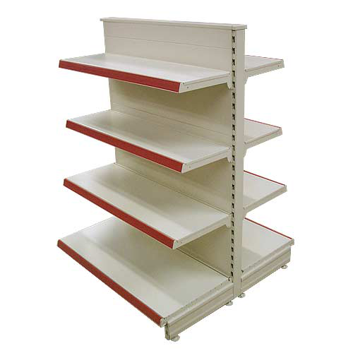
Finally, there are what are known as "merchandise outposts". These outposts are display fixtures that are placed in between aisles or in open spaces of your store. These break the otherwise fast pace that your path might cause for customers, and make them inclined to make impulse buys with products that are placed at eye level.


Validate your login